Tuesday, July 31, 2012

...yet another new journal ;-)


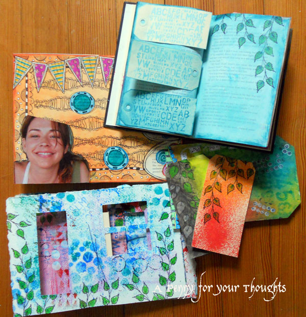
I had a new binding technique to try and so I made a new journal - I can't think of a better way to try it out ;-).  I learned about this from an online class by L.K. Ludwig called Just Three Journals.  This one is the sewn over tapes binding.  I used a lot of scraps to construct it - the inside is Bristol paper from clearance tablets I paid $5 for, the covers are the tablet backs, and I covered them with drippy inky paper left over from my canvas portfolio journal pages.  The tapes are twill tape that I received in a package from an order from Donna Downey's store and I loved the color and thought I could use it someday.  The opposite side has her name printed on it, so I just flipped them over.  Not sure yet if I'll leave the cover as is or if I'll add to it......hmmmm.


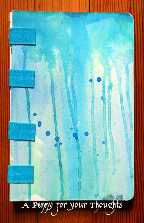
This is how the spine looks when it's all sewn together.  I love the look of open spines!

Here are pictures of a couple of the pages inside.  They are from prompts from a different online workshop offered by Teresa McFayden.  I'm working my way through the one called Between the Lines, but she offers quite a few others as well.


Monday, July 30, 2012

CC2C week 15 - Butterfly Collage


A fun technique for this week's Compendium of Curiosities Challenge using page 56 from Tim's book - "enameled metals".  I tried out the technique 2 ways - first on the background panel (where I also tried playing with a diffuser to create the center circle) and also on the butterfly which is a Memory Box die-cut.  I wanted more of a aged metal effect on the background, but tried to make something closer to verdigris on the butterfly.


You can see the butterfly better in this view.  After die-cutting the intricate top layer, there's a companion shape that I die-cut from watercolor paper and colored with the summer Distress Inks and added some water flicks to mottle the colors a bit.

Wednesday, July 25, 2012

Classes with Dyan Reaveley


This past weekend I had an immensely FUN time taking classes with Dyan Reaveley, truly as colorful as her ink sprays!  These are all the projects I came home with from the four classes and you should've seen my colorful fingers!!!  Truly the mark of a good day.  I learned so many fun techniques, made two little books and started altering a third, and learned some cool inky techniques on tags.  I also learnt some "proper" English - like the kitchen roll - "it's a roll and it lives in the kitchen" - and all its many artistic usages, how to properly waft your heat tool, not cook your project, and to never waste time faffing...oh, and never get a ruler out in one of her classes... trust me I saw someone try, just don't do it ;-).  If you have an opportunity to take one of her classes, don't even hesitate because you will have so much fun, will laugh a lot, and come home with loads of ideas.


That's me - the short one in the middle - and on the right is Kate, Absolutely Everything's owner.  Notice that cool apron?  It worked so well!


I had Dyan sign this page in the altered book we worked on.  It was just a plain painted background when she signed it and then I added ink sprays through her stencils and doodling to embellish the pages.


Here's another of the projects which was my favorite from the classes.  In this one she taught basics of building an art journal page using paint and ink, rubber stamps and pens, book pages, and a magazine image.  Mine is from Family Circle of a girl in an asthma medication ad - I just loved how the top of her head was cut off because it then could look like she had so many ideas spilling out of her head  - truly what happened in these classes, and she's as happy about it as I was :-)

Tuesday, July 24, 2012

CC2C week 14


I put together this tag (again with flowers!) to be able to join in on week 14 of the Compendium of Curiosities Vol. 2 Challenge sponsored by the Funkie Junkie Boutique where this week's  featured technique is Gilded Kraft Glassine on page 39 of Tim's book.  The technique creates a terrific textured paper that I cut into petal shapes and made flowers to add to my doodled swirl.  I have to admit though, when I first put them onto the tag, I think it looked more like a bunch of eggplants hanging on a vine - eek!!  So I added some white pen accents and then had a scrap of 7Gypsies Life tissue paper already collaged onto canvas paper sitting in a pile on my table that I could cut up and add to the petals.  I love the fun random phrases of the paper.

Here are the close-ups.  I've been using lots of textured backgrounds for my tags lately, but I also like having the texture as an embellishment on a tag simply sprayed with Dylusions colors.


Wednesday, July 18, 2012

A fun apron :-)


I wanted to have a fun and funky apron to take with me to some upcoming art journaling classes I get to take this summer and thought I'd share it.  I bought a cheap canvas apron at Michael's on clearance for $3.50 and added a pocket.  I first painted a layer of watered down gesso because I wanted it to have painty drips and knew that the fabric would just absorb the paint if it wasn't primed - at least that's what happens in my fabric journals.  It has made the apron a bit stiff, but maybe that will change with use.  This first picture shows my drips of acrylic paint washes.  It was a nice sunny day, so I was able to do all this outside which made clean up a breeze ;-)


Next I added white paint through a harlequin stencil from Crafter's Workshop, circles with a lid and a Scotch tape ring, and small dots with a pencil eraser.  Then I sketched my words and phrases in pencil where I wanted them and got out my India ink and dip pen to add the writing.


I love the end result and it was so much fun to make!

Tuesday, July 17, 2012

CC2C week 13

This week for the CC2 Challenge sponsored by Simon Says Stamp, one of my favorites was chosen - spritz and flick distress from pg. 42 of Tim's book.  I love the mottled look of this technique and had to take a picture of my undecorated tag.  I started with modeling paste through a Crafter's Workshop stencil on my tag before doing the spritz and flick distress - I love the texture the modeling paste creates!

Here's a close up:


...and here's my completed tag embellished with an image from the Graphics Fairy and vintage dictionary text die cut with the harlequin strip die.  I dyed the white ric-rac with the same Distress Inks used on the tag - such a great (and quick!) way to have perfectly coordinated tag ties.


Distress Ink colors: Victorian Velvet, Dried Marigold, Peacock Feathers and Salty Ocean

Tuesday, July 10, 2012

CC2C weeks 11 and 12

For the CC2 Challenge this time, it's a combination of pages 33 and 34 of Tim's book - configuration boxes techniques.  Like so many of you participating in these challenges, I had a configurations box I'd been saving since I found it on sale at Michael's.  My idea is a combination of a vintage sewing box theme and inspiration of wooden spool scrolls I've seen in a couple Stampington publications.  I stained torn strips of muslin with Distress Stains and stamped random words and phrases that came to mind on them.  Then I attached each strip to a spool and added an eyelet to one end which I used to tie a length of baker's twine to wrap around it and hold it in place.  I added buttons in places, and kraft colored chit-chat stickers mounted on black cardstock in others.

Here are closer views of the compartments:


And here are all the spools opened up.  I chose to not attach them in the compartments so that I could pull them out and read them from time to time... although in my house, that could be risky as one did fall out and was quickly utilized as a cat toy!!!!  Fortunately, I rescued it and put it back in its place :-)


Monday, July 9, 2012

Second Floor Challenge

Second Floor

Thought I'd play around with Julie and Nathalie's second floor challenge again where the theme is pencils.  Do you remember making pencil and crayon rubbings as a kid?  I wanted to see what kind of items I could find around my house to use as textures for pencil rubbings.  This is what I found:


I chose a few favorites and created a somewhat random background for an art journal page in my recycled kraft paper journal.


I wanted to add something to it, but still wanted to stick with using just pencils on my page, so I got out my colored pencils and made rubbings on the bamboo mat and my opened window's screen in the colors of the flowers currently blooming outside the window - oranges and reds and purples.  I also needed greens and used one of the picture frame textures for that.


I had an idea to paper piece flowers from it to create this journal page.


Here's a close-up to see the textures better:


It's fun limiting yourself to certain supplies and then creating something.  I did miss my black pen!  I think things would've looked much better outlined in sketchy black pen lines - what do you think?

Check out this month's Scrap365!


I'm so thrilled to have another article in July's Scrap365!!!!

Of course, I can only show a tiny peek....


If you get a chance to see the magazine, check out page 40 to see what I've made.  I'm so very proud of this project because it includes so many of my favorite things, and I made something that is really "me".  I hope you like it too!