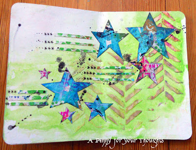
Saturday, September 29, 2012

My days spent with Dina

Last week I spent three days at Ink About It in Westford, MA taking four classes with Dina Wakley, a truly awesome teacher! (Thanks for taking the picture Erika! )  She brings to her classes all of her experience with so many mixed media techniques, knowledge from studying great artists of the past as well as contemporary ones, and fantastic tips to help you think about color and composition and the flow of your pieces.

These are all the projects we did in the classes - I loved them all!

This one is her 'homage to Dyan Reaveley' class - so funny that I took Dyan's 'homage to Dina Wakely' version earlier this summer! - using Dylusions inks and stamps to make a folded one page book to hold a set of tags.


This accordion book is comprised of collaged tags starting with paint and ink randomly on the tag and completed using book papers, computer generated quotes, and stamped tissue paper all layered together with beeswax. I've not done much with beeswax and really enjoyed  putting this one together.

Here are a couple close-ups of some of my favorites:


Next I have my results from her drawing faces class.  I have to confess that I've never drawn faces before - never actually tried because I didn't think I could.  I was amazed by the results with Dina's tips and a Stabilo Marks All pencil! I still need a lot of practice here - especially with lips ugh!! - but I do feel more confident to try.

This close up is of the background from the one on the right.  I love the visual texture you get from scraped acrylic paint and lifting it with stenciling!  This is becoming a new favorite :-)

The final class was an all day play with art journaling and we made SIX pages and combined them into a book. I learned SO MUCH in this class from creating a starting background to composing a page taking into consideration your focal point and how you want your viewer's eye to be directed around the page.  One incredibly helpful part of the whole class was offering up a page for the class to critique - I've never been in a class that did that before.  There were so many talented people in the class and they gave such great opinions about what they would do next and options and ideas to consider.  Not only did you learn something from your own page, but in seeing other's pages and discussing what was working and what needed work you start to develop a critical eye that will be invaluable as you make more and more pages, not to mention the inspiration of seeing what everyone else was doing with the same basic supplies.  Before folding the pages into books, we all laid out our pages all around the floor of the store. Wow.  It was great to be a part of that class.

Here are my pages:

This one uses a classic Dina silhouette mask technique and writing inside of it.

More shape silhouettes and the start of my attempts to leave more white space rather than flooding a page with color.

More Dina silhouettes, but as stamped tissue paper collaged onto the page. I worked on this page after doing the background in class, and I kind of created two focal points as I played.  I wasn't sure what to do so I tried linking them together with messy writing that is more of a design element, a feature of Dina's work that I really like.

This page has a gel medium resist foundation. I'm not sure what I'll do next with this one.......

I love this page - there's more of the fantastic scraped paint and lifted stenciling background with a pop of complementary colors added with the collaged elements.

On the final page I had Dina add her autograph, and I've played with it more since the class - it was a messy spray ink stenciled background that I wasn't happy with, so I gessoed over it - all but the autograph, of course! - and then did some guess what...scraped paint and lifted stenciling! I added Stabilo pencil circles and swirls and added Portfolio oil pastels for color and some visual texture with a text stamp and turned them into flowers. Maybe it needs some book paper leaves.....

I have had what feels like a perfect trifecta of mixed media experiences with classes this summer starting with Dyan Reaveley in July, Julie Fei-Fan Balzer in August, and now Dina, too. I really feel like each one has built upon the other and I have learned a tremendous amount from these fabulous teachers to keep my creative juices flowing for quite some time!


Tuesday, September 25, 2012

CC2C week 22: Steampunk faux altered book


This week at Linda's Compendium of Curiosities Vol 2 Challenge (sponsored this time by the Funkie Junkie's Boutique) the featured technique is riveted patchwork from page 57 of Tim's book.  After taking a class with Tim back in May where I learned this technique, I came home and created one of my faux altered books and used the riveted patchwork technique as the book covers and have been saving this project until this particular challenge came up. I added a combination of metal and altered chipboard gear diecuts on the outside and when you open the door.......


......you can see that the entire piece is a deep niche for my dimensional collage of an inventor complete with blueprint paper I made using stamped images white embossed and then colored with chipped sapphire Distress Stain.

Here he is complete with gears turning in his head and a light bulb - you know he had to have those to illustrate all his creative ideas, right?

Image: Digital Collage Sheets, Stamps: StampersAnonymous

Sunday, September 16, 2012

CC2C week 21

I've made another collage on a corrugated cardboard base for this week's Compendium of Curiosities Vol.2 Challenge sponsored by Simon Says Stamp. The technique this time is blended stains found on page 45 of Tim's book.  I used it on my background paper, which was first stamped with white acrylic paint to give a fun resist, on another piece of background paper created with different colors and then stamped with butterflies and cut out, and finally on the piece of seam binding ribbon.  I felt a need for some softer vintage colors when I got the stains out to play.  I've been enjoying my bright colors, but it still is nice to turn to the softer ones now and again.


The close-ups let you see the details better, and also see how stacking two of the butterfly images gives them more dimension.

Stamps: background: Hero Arts, butterfly: recent cover stamp from Craft Stamper
Distress Stain colors: tumbled glass, bundled sage, victorian velvet, dried marigold

Friday, September 14, 2012

and the journal goes to....


Thank you to everyone who left such nice comments about my journals!  I placed everyone's name in a basket and drew a winner........

 
Congratulations Debbie!!!!  The journal will soon be on its way to you and I hope you have fun filling it :-)

Tuesday, September 11, 2012

CC2C week 20 tag


This week at Linda's Compendium of Curiosities Vol.2 Challenge, the chosen technique is found on pg.44 of Tim's book - enameled stamping.  Really creates a great background for my tag.  I embellished it with script stamped bits from another tag and then two flowers I stamped using a watercolor stamping technique with distress inks and added outlining.  I've been loving the look of watercolored images and the distress ink gives cool blending when used that way.

Stamp credits: Rubbernecker Stamps, Red Lead, Donna Downey for Unity Stamps

Sunday, September 9, 2012

Second Floor Challenge #8


I really liked the idea of the current Second Floor Challenge run by Julie Fei-Fan Balzer and Nathalie Kalbach - using three stamps.  I definitely consider myself a stamper and thought I'd add my own twist to the challenge and not use any ink.  Here is my completed journal page in one of my manila file folder journals.  Not an exceptionally pretty page, I must admit, but so much fun in its construction.

I'll share my process:


First off, I'm still highly addicted to using my gelli plate and monoprinting with paint.  So I used the French script stamp from Red Lead after covering the plate with paints.  This was the first time I tried pressing a journal onto the gelli plate.  Not a perfect print, but it is a very cool negative script texture.  I still had paint on the gelli plate, so I made a second impression, and then with the remaining paint on the stamp, I pressed the stamp directly onto the page giving the positive image.


Here's a close-up showing both the positive and negative of the script stamp. (And this is closer to the true color of the manila file folder page - too much sun light on my whole journal page.)


Because I still had paint left on my palette, I used two different sizes of bubble wrap to create monoprints and created a bunch of mop up tags.  Nothing to do with my current page, just further evidence of my gelli plate addiction!  Cool designs, don't you think?


OK, next I wanted to add more blue and to try stamping with Pan Pastels.  Now I've done it using Versa Mark, but that's an ink, so I didn't want to use it.  I found that if I spritzed the stamp with water and tapped it onto the Pan Pastel, it stamped with a neat grainy effect.


Here's the second stamp added - my hand carved chevron zig-zaggy thing.


See the grainy texture?


Definitely spray this with a fixative, because it will rub off.

On to the third stamp, and I chose to create a word using a set of Alphabet stamps and neocolorII watercolor crayons.  It's so easy to color onto the stamp, spritz it with water and stamp.


Here's how the word looks when stamped.


...and here are all three stamps used together:


To complete my page I added journaling along the bottom and up the left then all the way back in the opposite direction trying to weight the design of my composition to the lower left corner as you can see in the very first photo on the top.  The journaling reads: "I love when I try to challenge myself - as long as I'm brave enough to follow whatever tangents may present themselves - it's amazing where your creativity will lead you.  In this case, stamping with absolutely no ink! Whether it's acrylic paint, pan pastels, or watercolor crayons - SO MUCH FUN to just play!"

What have I learned?
1. Gelli plate monoprinting is really cool!  OK, I already knew that ;-)
2. I find that I think more when my supplies are limited, and it's fun to try out the ideas you come up with.
3. I tried to choose neighboring colors on the color wheel: green, blue-green, blue, and violet - also all cool colors. I thought about using a complementary color, a red or an orange, instead of the violet for more of a pop, but I do like how neighboring colors play nicely together.
4. It's OK if your page isn't pretty; this one was a great experiment to see how things worked together and that is absolutely allowed in art journaling.

Supplies:  Liquitex acrylic paint colors: vivid lime green and cobalt teal, Pan Pastel: phthalo blue, NeocolorII crayon colors: violet and periwinkle blue. Stamp credits: Script text: Red Lead, Alpha: Stanyan from Purple Onion Designs.

***********************
Thanks for reading all the way to the end of this long post! Be sure to check out YESTERDAY'S POST for a handmade blank journal GIVEAWAY. The winner will be drawn on Friday September 14th.

***********************

Saturday, September 8, 2012

Learning new bindings and sharing :-)


Recently I had some fun playing with monoprinting using paint and a gelli plate.  I printed onto deli paper and unryu paper.  This was the pile spread out onto the floor to dry.


Here's a close up of the papers.  I used a text rubber stamp, a paint comb, bubble wrap, and a cardboard tube to create designs on the gelli plate and also stamped off onto the papers using the same items.  I further decorated the papers with random text stamping with black archival ink and added white acrylic paint through a circle stencil.


Metzger watched my whole process and approved of my final designs ;-)


So......what to do with all these wonderful papers.......hmmmmmmmm............

They were PERFECT to cover binders board to use as covers for 2 new open-spine binding techniques I wanted to try after watching  a video class by LK Ludwig.


This journal is about 8"x10" and is comprised of heavy weight manila file folders.


This binding is called wrapped straps or wrapped tapes.  I used twill tape remnants to make it.  (You may remember my sewn over tapes binding used in the journal in THIS POST.)


This is a close up of the binding of the blue journal called seed pearl stitch binding, and it's done with leather straps.  Isn't it cool?  I love the way it looks!!!  This journal is about 7"x11" and the pages are of Bristol.

So did you happen to notice that I made TWO of the blue journals?  I loved playing with the binding stitch and couldn't stop with just one!  So.............................................................................

I have one to share and I've decided to hold a giveaway!!!! 


The cover is embellished with 2 hearts, some machine stitching done before I adhered the unryu paper to the cover boards, and a handwritten word - create - embellished with some doodled dots.  Leave me a comment letting me know what you would do with this journal if it came to your part of the world.  The Bristol paper is perfect for all types of wet media as I've been finding, and it would make a terrific art journal, but it could also be a journal to record your thoughts, a sketchbook, or a cool smash book style scrapbook.  On Friday September 14th I'll randomly pick a winner.  Make sure that I have a way to reach you if your comment is chosen.

Saturday, September 1, 2012

A little sneak peek...


I'm excited to have another article published in September's Scrap365!!!!  Here's a little peek for you:


...and yes, that's me :-)

Here in the US you can find Scrap365 in Barnes and Noble, they're just often a month or two behind.